library(tidyverse)
library(here)
music_health <- read_csv(here("data/music_mentalhealth.csv"))
music_health$`Music effects` <- as.factor(music_health$`Music effects`)
Introduction
Welcome to my 2nd Blog Post!
The following data set I am working with, is from the results of a self-reported survey on the effects of music on a person’s mental health status. The data set is shown below..
head(music_health)# A tibble: 6 × 33
Timestamp Age Primary streaming se…¹ `Hours per day` `While working`
<chr> <dbl> <chr> <dbl> <chr>
1 8/27/2022 19:29:… 18 Spotify 3 Yes
2 8/27/2022 19:57:… 63 Pandora 1.5 Yes
3 8/27/2022 21:28:… 18 Spotify 4 No
4 8/27/2022 21:40:… 61 YouTube Music 2.5 Yes
5 8/27/2022 21:54:… 18 Spotify 4 Yes
6 8/27/2022 21:56:… 18 Spotify 5 Yes
# ℹ abbreviated name: ¹`Primary streaming service`
# ℹ 28 more variables: Instrumentalist <chr>, Composer <chr>,
# `Fav genre` <chr>, Exploratory <chr>, `Foreign languages` <chr>, BPM <dbl>,
# `Frequency [Classical]` <chr>, `Frequency [Country]` <chr>,
# `Frequency [EDM]` <chr>, `Frequency [Folk]` <chr>,
# `Frequency [Gospel]` <chr>, `Frequency [Hip hop]` <chr>,
# `Frequency [Jazz]` <chr>, `Frequency [K pop]` <chr>, …The potential variables of interest for this post will be Hours per day, While working, Exploratory, Fav genre,Frequency [Classical], Frequency [Country], Frequency [EDM], Frequency [Folk], Frequency [Gospel], Frequency [Hip hop], Frequency [Jazz], Frequency [K pop],Frequency [Latin], Frequency [Lofi], Frequency [Metal], Frequency [Pop], Frequency [R&B], Frequency [Rap], Frequency [Rock], Frequency [Video game music], Anxiety, Depression , Insomnia, OCD, and Music effects. In total the data set holds 736 observations, each one being an individual who completed the survey.
The question of interest investigated will be, “Did music improve the mental health conditions of these respondents?
Data Context
Originally, the data was collected by Catherine Rasgaitis, who used a Google Form. The form was posted across social media platforms such as, Reddit and Discord. Posters and business cards were displayed and handed out the public in libraries, parks, and other public locations. The author of the data is Catherine Rasgaitis, who studies Computer Science at the University of Washington. The data was collected from 07/27/2022 - 11/08/2022. From individuals from all over the world.
From that point, the data made it’s way onto Kaggle.com, where I got a hold of it. The following URL is the main page of the data set, https://www.kaggle.com/datasets/catherinerasgaitis/mxmh-survey-results.
Visualizatons
# Histogram of mental health variables
music_effect <- music_health |>
  pivot_longer(cols = c(Anxiety, Depression, Insomnia, OCD), names_to = "Mental Condition", values_to = "Score")
ggplot(data = music_effect, aes(x = `Score`)) + geom_histogram(fill = "gold", color = "black", bins = 8) + facet_wrap(~`Mental Condition`) + theme_bw() + labs(y = "Total Count", title = "Distribution of Mental Health Scores\nAcross Different Conditions")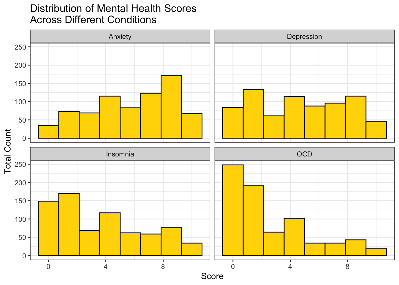
From the histograms, you can see that the Depression and Anxiety distributions are nearly even, except for a slight left skew in Anxiety. The Insomnia distribution seems to also have a minimal right skew and the OCD distribution has an obvious right skew.
music_plot <- music_health |>
  group_by(`Fav genre`) |>
  filter(n() >= 25, !is.na(`Music effects`)) |>
  mutate(positive_ind = if_else(`Music effects` == "Improve", 1,0)) |>
  summarise(positive_prop = sum(positive_ind)/ n()) |>
  arrange(desc(positive_prop)) |>
  mutate(`Fav genre` = fct_reorder(.f = `Fav genre`, .x = positive_prop))

ggplot(data = music_plot, aes(x = `Fav genre`, y = positive_prop)) +
  geom_bar(stat = "identity", fill = "lightyellow", color = "darkgreen") +
  theme_minimal() +
  labs(y = "Proportion of People Reporting\nPositive Music Effect", x = "Genre") +
  coord_flip()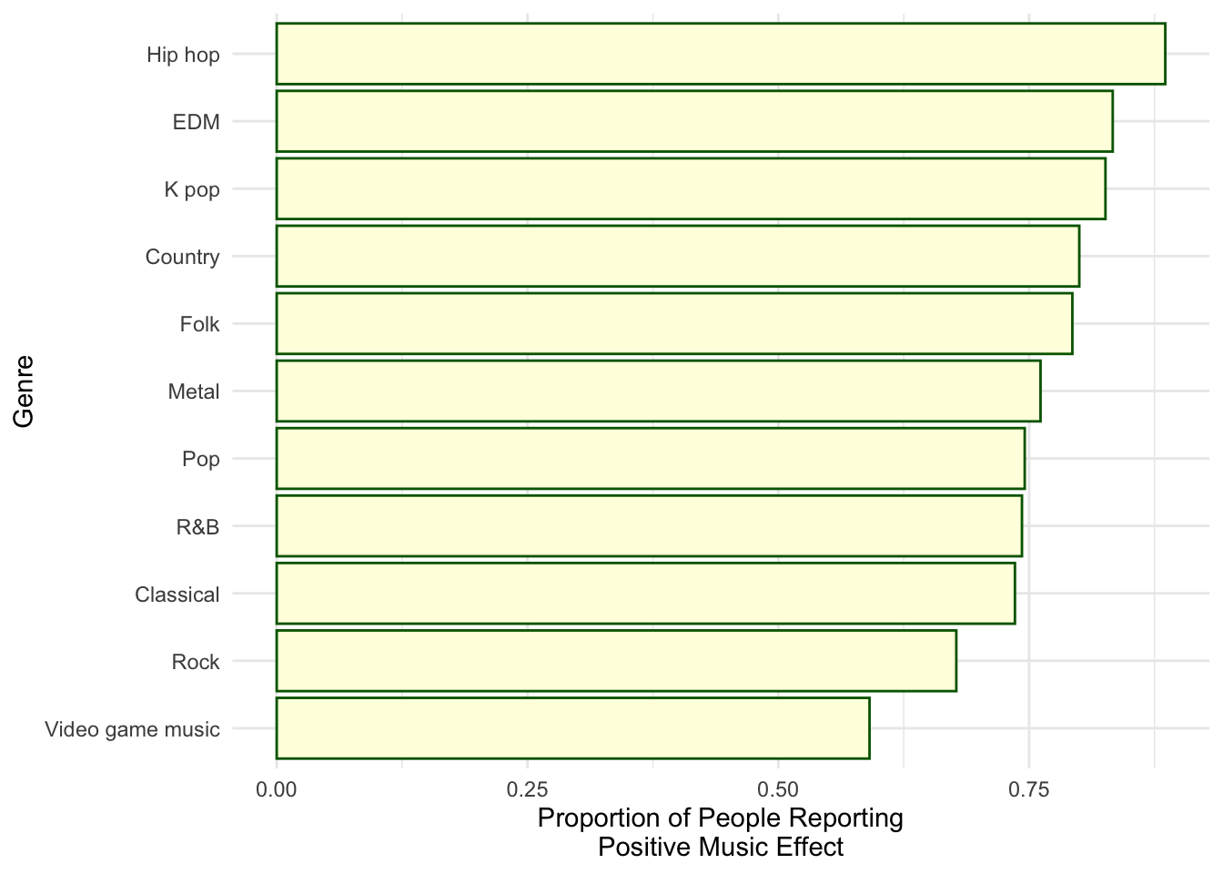
In genres that were listed as a favorite by 25 or more people, hip-hop had the highest proportion of people reporting that they had like felt their mental health had improved because of the music. On the contrary, people who had video game music as their favorite genre, reported the lowest proportion in the group.
ggplot(data = music_effect |> filter(!is.na(`Music effects`)), aes(x = `Music effects`, y = Score)) + geom_boxplot(aes(fill = `Mental Condition`), alpha = 0.7, coef = 0.1) + scale_fill_viridis_d() + theme_minimal() + ylim(0,10.5) + labs(x = "Music Effect on Mental Health", y = "Self-Reported Score")
The box plot shows that for the people who reported that their mental health improved because of music, they scored anxiety as their highest. On the contrary, the plot suggests that for people who reported that their mental health had worsen, they scored depression highest. From this, I conclude that perhaps anxiety can be effectively treated with some music for individuals.
Conclusion
It’s important to understand with this post and research that there are some flaws. One of them being that their is no control for factors that could effect mental health like, stress, hours spent sleep, and social support. Also, all of the respondents are self-diagnosing for conditions that require professional evaluation.
In the future, if additional data was present, the prospect of creating a model to predict mental health scores is intriguing to me. I could also explore the question if certain music genres had more effect on specific mental health conditions. For example, I could explore if folk music has more of an effect on anxiety than hip-hop.
Connection to Class
The distribution of mental health scores for each condition is crucial for establishing a deeper understanding of the data and the visualizations that follow. Graphing the distribution, helps readers understand the variability in the data and identifying trends.
All the graphs I believe do a fair job at allowing the audience to make easy comparisons between the groups. The control for the sample size of people reporting a specific genre as their favorite in the second plot is important as well. I also think the third plot incorporates the idea of expressing variability in visualizations to give the audience a better view of outliers and their potential effects.